When was the last time you downloaded an app without looking at its screenshots? For most people, the answer is never. Screenshots are one of the first things users see, and design is key. In just a few swipes, someone decides to download your app, or move on. No matter how good your app is, poor App Store screenshot design can cost you massively.
Think about it, when you’re browsing the App Store, do you read the description first? Of course not, your eyes dart straight to the screenshots. That quick glance decides whether you hit download or keep scrolling. Here’s why screenshot design matters.
In this post, I’ll share five reasons why screenshots are critical to your app’s success, and how I applied each one to my own project for Pocketwatch & Petticoats.
1: First Impressions Matter
Users only see the first three screenshots before clicking your app. That’s your moment to spark curiosity and grab attention. Think of it like packaging on a shelf - if it doesn’t stand out, no one picks it up. For Pocketwatch & Petticoats, I made sure the first visuals were bold and recognisable so they instantly popped.
2: Tell a Story
You’re not just selling an interface, you’re selling an experience. Screenshots should guide people through a journey, not sit there like random photos. For Pocketwatch & Petticoats, I created a carousel effect with overlapping visuals that encouraged users to swipe. Bold colours and clear flow helped tell the brand’s story while showing value.
3: Design Builds Trust
Design isn’t just about looking good, it builds credibility. Clean layouts and consistent brand colors make your screenshots feel professional and reliable. Who doesn't like a bit of pink? Using the brand’s signature color consistently helps build trust and recognition. Apps that look professional always feel more trustworthy than those that look rushed.
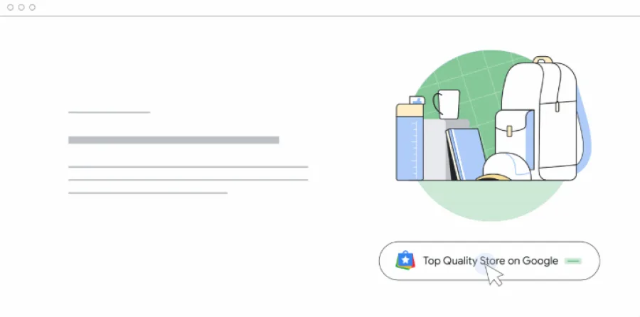
4: Stand Out in the Crowd
With over 1.8 million apps in the App Store, your screenshots need to do more than explain - they need to get noticed. For Pocketwatch & Petticoats, I combined familiar phone mockups with layered product visuals. This unexpected twist made the app memorable and stops users mid-scroll.
5: Sell the Outcome
People don’t download apps for buttons, they download for results. Screenshots should highlight benefits - discounts, organisation, convenience. For Pocketwatch & Petticoats, discounts were key, so I made them front and centre. Showing outcomes gets people excited to hit download.
Great screenshots aren’t decoration - they’re one of your strongest tools to drive installs. Done well, they grab attention, build trust, and show people exactly why your app is worth it.
If you’re ready to take your app’s screenshots to the next level, let’s make something that gets users to stop, swipe, and download. Reach out today via 01206 803999 or email us on [email protected]